
The itch
There are countless things you can time and probably as many reasons to do so. For us it really comes down to loving what you do and that can really become voraciously time consuming. So what do you do? You get organized. You write down things, use to-do lists, update calendars (by the way we did I mention we use
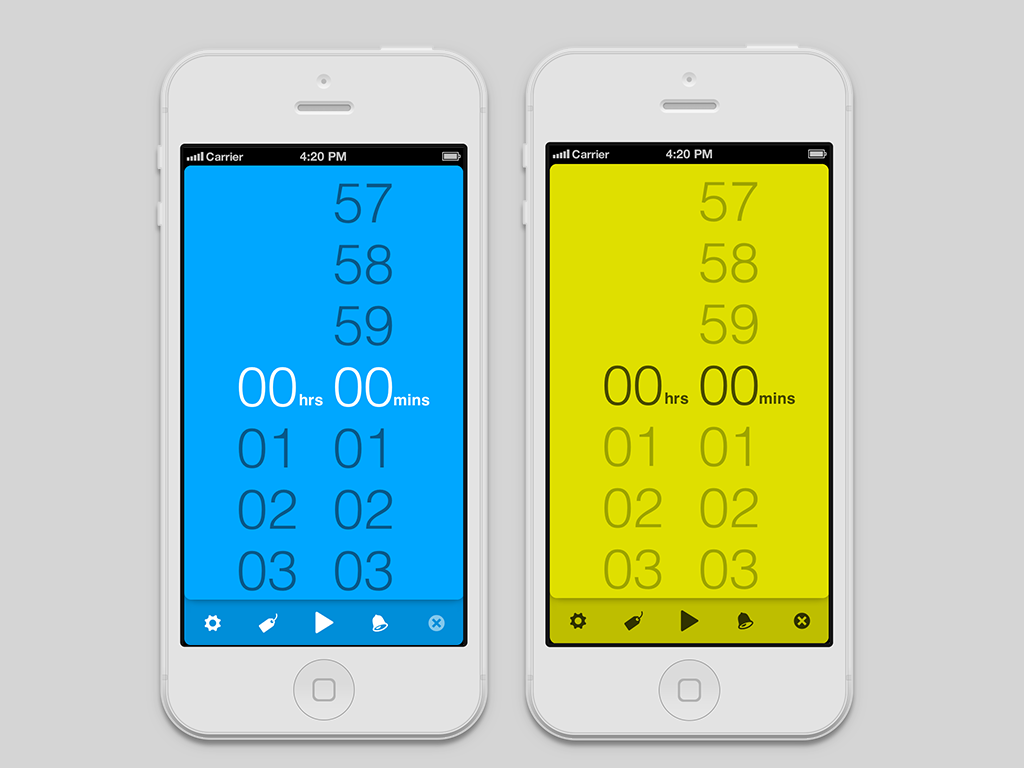
Flow? we love that app), and of course you time things. There are plenty of timers out there, pretty good ones actually, but in our case we wanted a timer with these specific characteristics: 1. Available on the go. We wanted to time things everywhere, not only on our laptops. An app on our smartphones is the best solution we could come up with. 2. Stopwatch & Countdown functionality. Sometimes you need to find out how long it took to do something instead of counting backwards. 3. Simple and fun to use. Most of the apps we used were either too complex, requiring too many steps or over-simplified, sacrificing functionality. So here's what we made:
The interesting part is how we got there and what we learned in the process so we’d like to share some of the most important practices:
1. Build actual prototypes. Then throw them away.
It's painful but it's worth it. Contrary to what many believe, design is not just about picking colors and playing with photoshop. Design is how something works and no amount of photoshopping mockups can work as a substitute to picking up the smartphone and using the app itself. In this context, we didn't stick to static mockups but started building working prototypes very soon in the development lifecycle and kept doing so, revising our approach as we fiddled with the app.
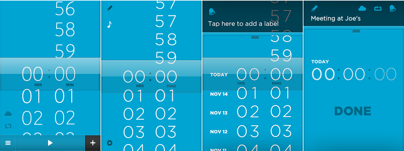 Here some really early (…and rather embarrasing) mockups we made, some of which actually made it to the prototype stage.
This process gave us a clear direction as to what worked and what didn't so we ended up practically recreating most of the standard iOS UI components. One of the most prominent components of the Timeless App is the time picker. Of course, UIKit already contains a picker component but the limitations imposed in customizing it are so many that we decided simply not to use it at all. Many more things had to be modified as well. The landscape view with the timers' table is actually very different than the default table component to provide easier and more intuitive handling of the timers (and we have more upgrades on this in the following versions) and even the "on/off" switch was actually rewritten to fit our standards. Small details one could say, but when coming together they have a profound impact on the final result. Meanwhile we started using Quartz Composer as an intermediate stage in the prototyping process and we are quite thrilled with the results.
2. Use the slowest device your customer might use.
Testing an app on the latest and greatest hardware can be too deceiving. Our set oftesting devices included an old iPhone 3GS even though most of our customers will probably run the app on newer models. The restrictions of slower hardware lead us to rewrite entire parts of the app from scratch and experiment with different ways to achieve the smoothest result possible. This in turn increased the quality of our code, and Doing all this testing and prototyping wouldn't be possible if it weren't for
TestFlight and Bugsense. They gave us the ability to download and try and monitor countless builds of the app on several devices, apart from making it super easy to send the app to our people outside our team for feedback and previewing before submitting the app.
3. Escape from your inner feedback loop.
Needless to say, we started using the app from it's early stages. We didn't stop there though. We wanted to gather feedback from a handful of people we trusted and valued their opinion so we send some Testflight invitations to download and use the app. A few days later we setup a fun little on-line survey asking about some of the most important questions we've been asking ourselves. This process helped discover bugs and shortcomings that we wouldn't have noticed ourselves.
4. Wait for the features to mature. When we set out to build Timeless we had a big list of features we kept only those that fit perfectly with each other so the initial release didn't have a stopwatch functionality. A few days after releasing Timeless 1.0 we came up with a way to make Timeless work as a stopwatch that in retrospect seems obvious. We knew this was the right moment to add that feature and we did.
The story continues.
Timeless is well on it’s way to v1.2 and we still have lot of things in store, even more things to learn and ideas to experiment with. A big thank you to all those that helped us ship something we love. If you found this article interesting, let us know and we’ll keep on posting updates about our progress.