June 7, 2022

Neybox.com has a brand new look!

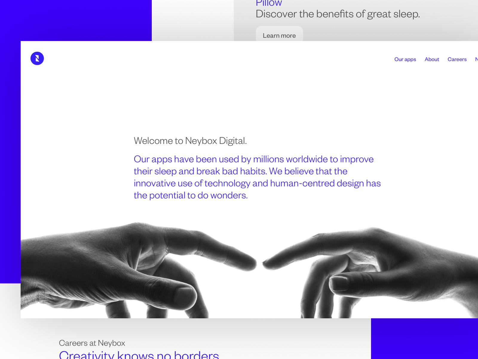
It’s been a while since we gave neybox.com a refresh. Neybox Digital has grown and evolved so much over the past few years and we are both proud of its accomplishments and excited about its next steps. We want Neybox’s site and brand to reflect this change too. It’s the home to all the new and existing projects that we love working every day and the best place to stay up to date.

Explore the new site and let us know what you think! 

August 7, 2018

Introducing the Stress Card

In small amounts, stress can be beneficial and even healthy. It’s a mechanism that motivates and activates your body to concentrate and complete the task at hand. The bad news is that too much stress can be devastating. Excessive stress sometimes is hard to notice and has the potential to cause so much damage in our physical and mental health experienced over extended periods of time, that it has been named “The silent killer”. 

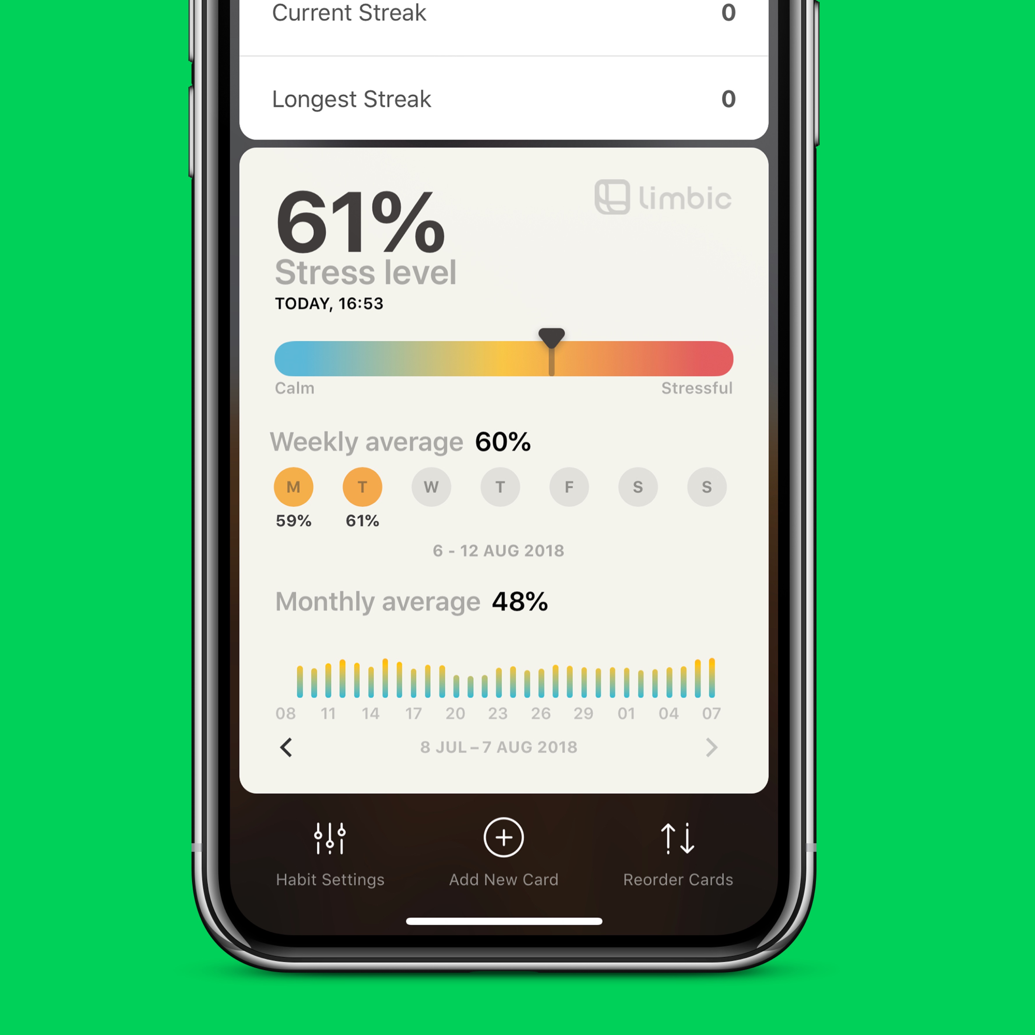
Developed in collaboration with Limbic’s innovative team, we came up with an idea to build a card that would allow you to monitor your stress levels on a daily, weekly and monthly basis. The Stress Levels card uses data gathered from a specific set of Apple Health categories to estimate your stress levels using Artificial Intelligence. The result is a stress level score from zero to one hundred percent. A low score between 10-30 indicates that you are very calm, a score between 40-60 is an indication that you are neither calm but not too stressed either and a stress level above 60 is an indication that you are likely under significant stress.

So all you need to do to use the Stress Levels card is wear your Apple Watch and add the card on your dashboard. Today will monitor and estimate your stress level score automatically and update it throughout the day.  Don’t be surprised by the values that you will get when you first use the card. Thanks to the use of Artificial Intelligence, Limbic’s algorithm has the ability to learn and improve its accuracy over time. Stress levels estimation is a very complex process so we recommend that you use the card for at least 15 days to get the most reliable result possible.

It goes without saying that that the Stress Levels card is not a substitute for any kind of medical and psychological procedure that is meant to help you measure and manage your stress. If you believe that you experience excessive amounts of stress and you’re worried that this may have an effect on your wellbeing, our recommendation is to consult a certified expert.

Today's comes with a lot of customization options and an easy way to share your status with anyone you want. 

To get started, download Today from the App Store

September 25, 2017

Sunsetting Timeless …for now

<tl;dr>As of a couple of days ago, Timeless has been removed from the App Store. Due to compatibility issues with iOS 11 and since we are currently lack the resources to properly adapt the app to the new frameworks, we sadly decided to pull it down. We will do our best to rebuild the app and release it again, but unfortunately (for now) no promises can be made on if or when. Thank you for your continued feedback and support!</tl;dr>

We started developing Timeless back a while ago, almost by accident. We were working on very different things back then with no immediate intention of entering the world of mobile apps. The whole thing started by a rough wireframe of the app that Panos has created as a side project; a fully featured timer, pleasing to the eye and easy to use, with an interface very different from what mobile was offering at the time.

2012 means iOS 6 (actually the app was mostly developed on iOS 5). Despite skeuomorphism being the norm, we favoured the idea to make an app in a totally different direction. As far as the design is concerned, Timeless was a leap forward: Instead of a button infested interface, we went for a flat approach and a UI that used gestures and device orientation for most of the navigation tree. The result was an app that could be used fluidly with a minimal friction for the end user.

Implementing Timeless was not easy; all native iOS components were designed to accommodate the skeuomorphic trend and very few of them could fit into our concept. So, we made a lot of things from scratch. From the duration selection pickers (that were so also inherited to Pillow) to a custom scrolling panel for navigating between different timers, everything was made from the bottom up. Endless (admittedly failed) attempts to put the concept in the device were made before, finally, getting it right. I vividly remember a time that we would have to scrap weeks of work because the resulting prototype was performing miserably on older devices (which was then the iPhone 3GS; our benchmark at the time).

Despite all, the reception of Timeless was better than we could have hoped for. We had the chance of being favourably reviewed by many prestigious publications and featured on the App Store. In fact, Timeless was still being promoted until the day we pulled it from the store. User reviews were also more than encouraging; people embraced the concept, praised the ease of use and the clean interface and continuously pushed us forward to extend, expand and improve the app.

After releasing the first version, and while Pillow was already starting to form in our minds, Timeless remained a priority. We constantly added new features and made sure to keep the app up to date with all the latest developments. Timeless made 4 major versions and many more minor ones. It was always one the forefront of adapting new iOS features such as the notification centre widget and the Apple Watch. In fact, Timeless was one of the first apps in its categories with an Apple Watch extension.

Sadly, all good things come to an end. We now have both Pillow and Today that are apps with great potential and a very long (and challenging) roadmap. We wish to have the capacity to maintain Timeless as well, but unfortunately this is not an option at the current moment. So, with a heavy heart, we decided to pull it from the App Store. We will make our best to bring it back, but we cannot make any promises as to when will that happen.

Timeless will always have a special place in our hearts: it has been our first app, we literally learned mobile by making it and we were exposed to the whole process of designing, building, releasing and promoting a product. We experimented with technologies, experienced frustration and enjoyment in many consecutive circles. The joy we got making it was the driving force that kept us into mobile development and guided our work in the years that followed. Even more than that, it was the app the practically solidified Neybox; it was the proof that we could do beautiful things and fuelled us for moving forward together. In that sense, for us, it is irrelevant of how many downloads Timeless had or how much money it made. It is (and will be) one of our most successful endeavours.
July 20, 2017

Today v.1.4 – Introducing the “Welzen” card for your meditations.

One of the biggest reasons we started working on Today was our realization that successful habit tracking and formation are at its core a very personal matter and that is precisely the way a good habit tracking app should look and feel. The concept of using cards with unique functionality to create your custom dashboard that suits your personal needs to track your particular habit lies at the core of that notion.

We decided to ship the first version of Today with seven types of cards, with the plan to add many more, introducing new functionality and integrations with other services and apps. Today we are delighted to announce the newest member to the family of Today’s cards: “Welzen,” a card to help you track and develop your meditation habit, one of the most popular types of habits tracked in Today.

This new type card is the first of many cards that will integrate with other apps and services. This one is the product of our collaboration with our friends at Welzen. Welzen is an excellent meditation app made by a talented and passionate team that cares deeply about Mindfulness and has put a lot of effort to bring you an app that will help you take advantage of the scientifically proven benefits of meditating. It comes with plenty of great features and a continuously updated selection of guided meditations for everyone, helping you fight stress and anxiety, increase your focus, sleep better, improve your relationships and creativity.

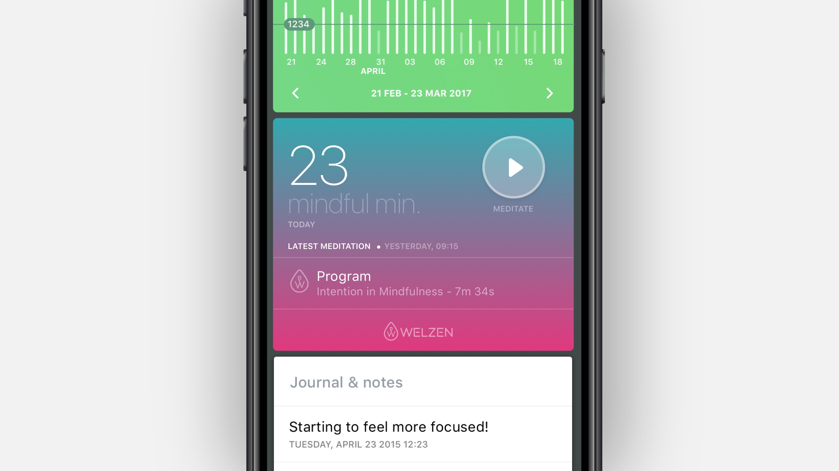
Using the Welzen card in Today is as simple as adding any other card. Add it to your dashboard, and it will immediately display the Mindful Minutes that you have recorded in Apple Health using Welzen. It will also display the latest meditation that you recorded in Welzne and quick way to launch the app and start your next session. The Welzen card is available in Today as a free update for all our users and the first of many more new cards that we are currently working on. As an added bonus you will find two new photo covers in Today's gallery inspired by Welzen.

Create a meditation habit with Today, add Welzen’s card and start meditating.

SaveSave

SaveSave

SaveSave

SaveSave

SaveSave

SaveSave

SaveSave

SaveSave

April 26, 2017

Today v.1.3 – Apple Watch app released

It’s finally here! Today for the Apple Watch is now ready to help you track your goals, build your habits in a powerful and intuitive way.

A natural fit

Forming a new habit is all about being aware and mindful of the process. Tracking your progress and getting all the insight that you need to stay motivated with the least amount of friction. This is what we envisioned for Today on the iPhone right from the very start and led us to an app that hundreds of thousands of users enjoy every day.

Today for the Apple Watch is a natural extension of that feeling. Instead of trying to replicate every single feature of the iPhone app, we created an app that distils the experience down to the essential actions that fit perfectly on that tiny magical device on your wrist. The result is a lightweight app that remains delightfully informative and complements what you experience on the iPhone.

Your overall progress at a glance

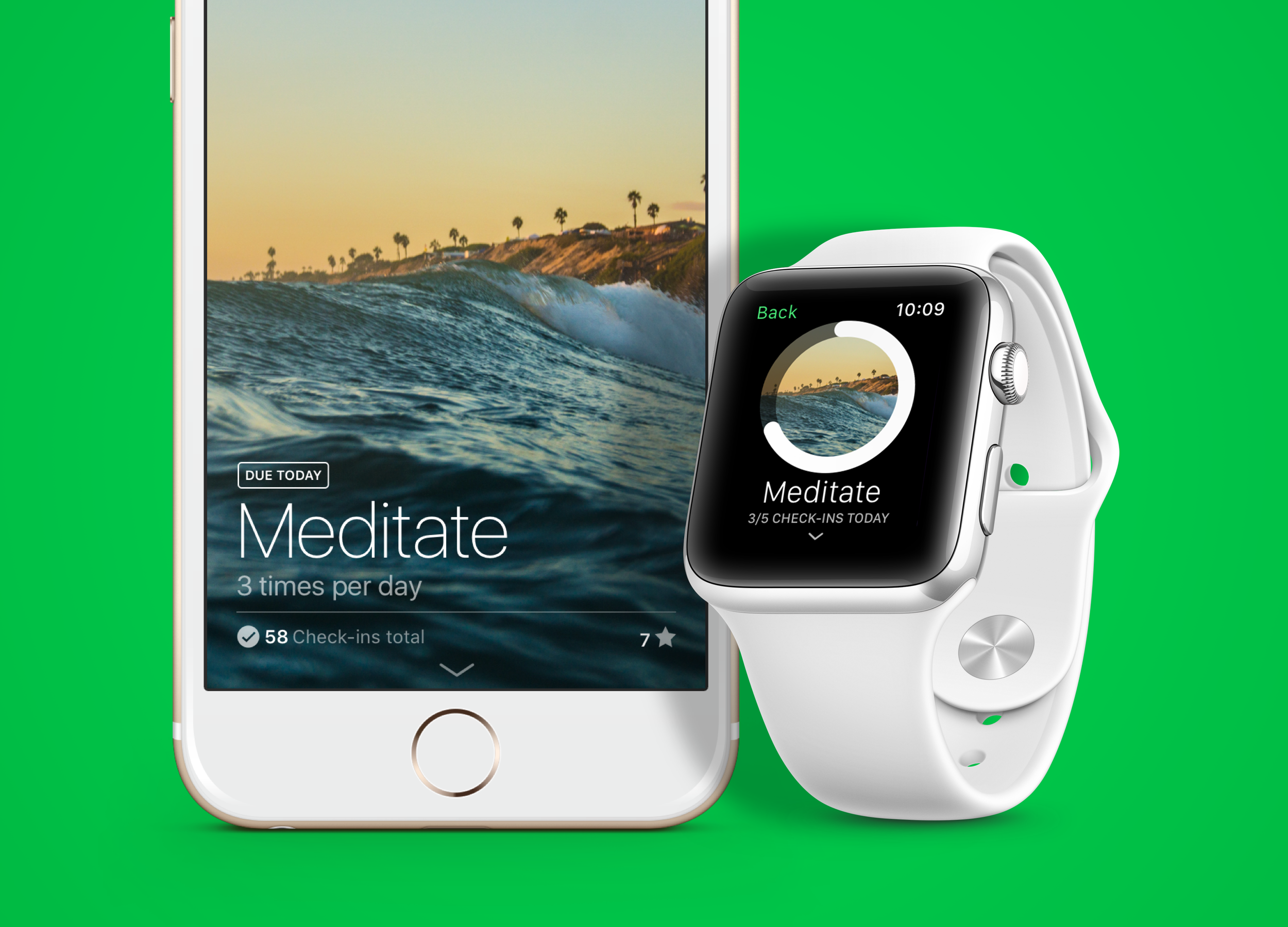
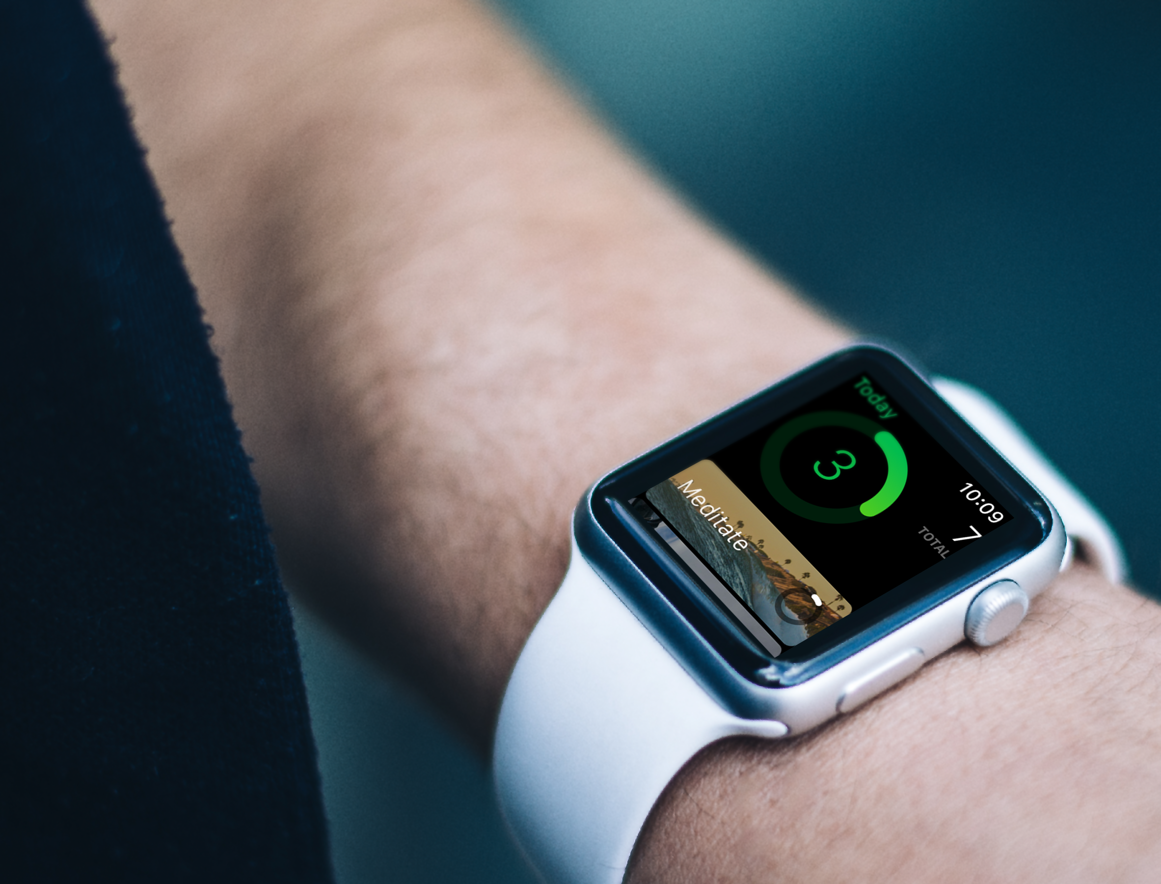
The main screen of the Apple Watch app displays a ring with your overall goal for each day: The total amount of check-ins you have to do based on your habits due for that day. It’s a great way to get a quick feeling of how well you are doing.

Below that ring, you get a list of all the habits due for the day with the beautiful cover you chose for each one of them and their progress as well. Tapping on each habit leads to a screen where you can check-in on the habit or scroll down to check your weekly progress, current and overall streak.

Close that ring

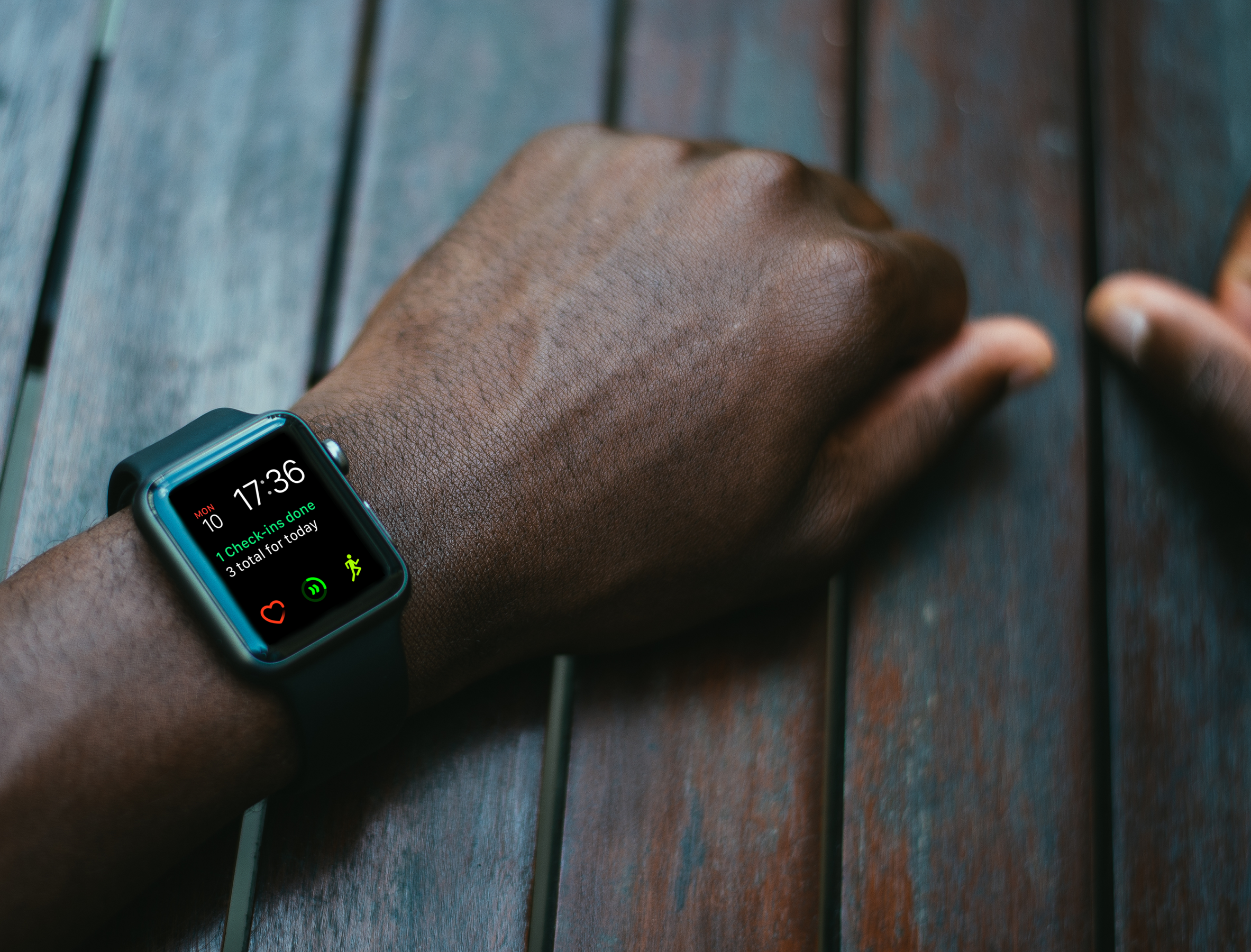
The complication of the Apple Watch is the same ring that you get on the main screen of the app. It feels right at home next to your activity rings and provides a quick and easy way to access the app. Without a doubt, the convenience of that little ring alone is an excellent reason to earn a permanent place on your watch face.

What’s next?

With the first version of the Apple Watch for Today successfully released, we’re working hard to bring you the next set of features, including more flexibility in the information displayed, easier input and innovations that we can’t reveal just yet 😉 It goes without saying we’re always open to ideas and feedback!

Today for the Apple Watch is available as a free update on the App Store, and we wholeheartedly hope you enjoy it as much as we do!

December 13, 2016

Today v.1.2 – Notification widget, Rich notifications and new Health cards

Another version of Today hit the App Store. This one brings a few of the much awaited and requested features that sit on the top of our mind-bogglingly long list of things we have in store for the future.

Here's what's new in Today v.1.2:

Notification widget

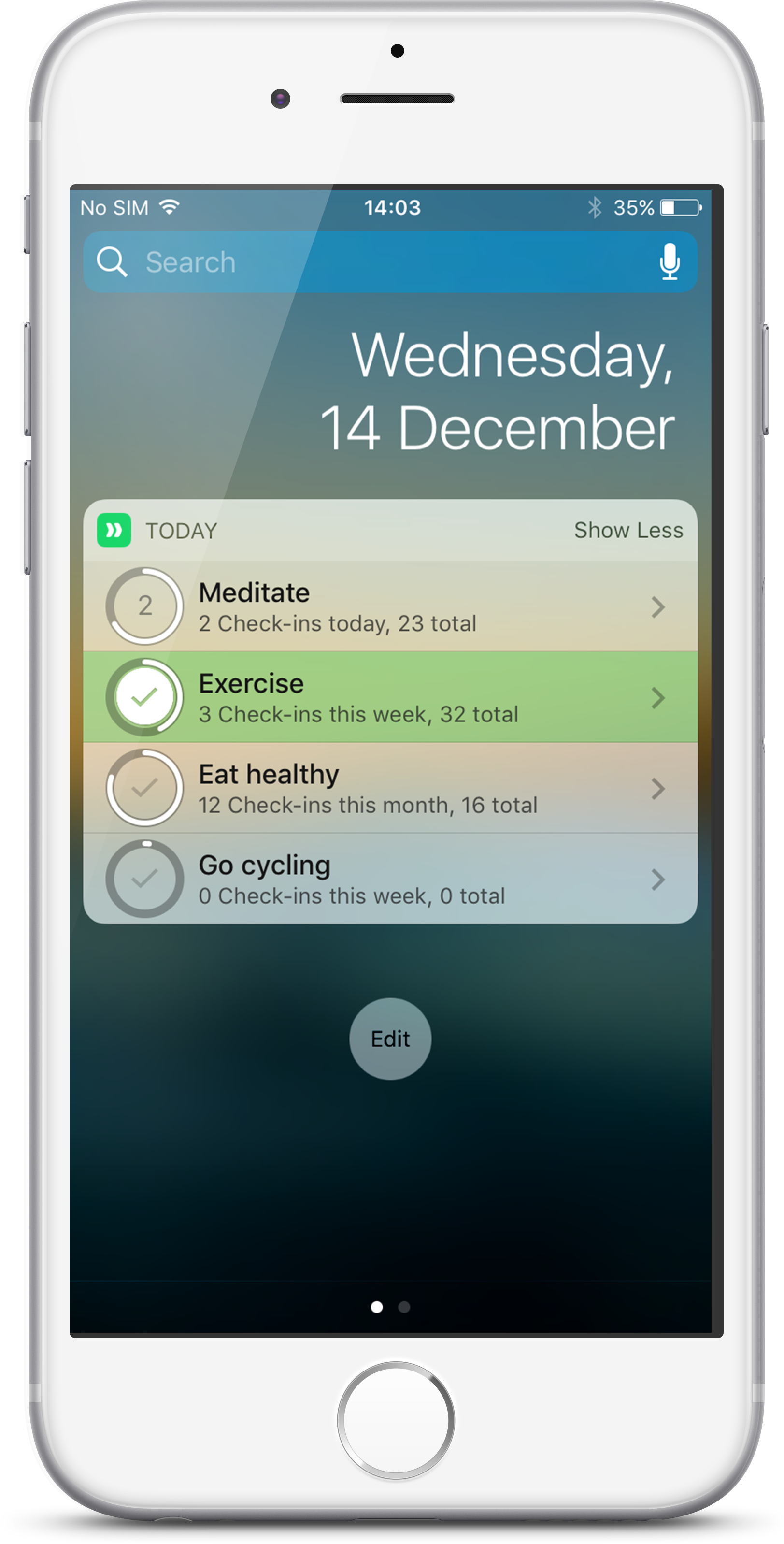
First and foremost we’ve got a widget for the notification screen that supports both iOS 10 and iOS 9. The notification widget displays all the habits due for the day. Tap on the habit’s circle to check-in or tap on the habit’s title to open the habit directly in Today. Simple, right?

Private habits

What if you want a habit to be private or you don’t want it to appear in the notification widget for whatever reason?

You can now mark any habit as private. Private habits won’t show up in the widget and all your reminders for that habit will hide their data and just display a generic “It’s time for a check-in”. To set a habit as private, simply open the settings panel of that habit and turn the ‘Private habit’ switch on.

Rich notifications

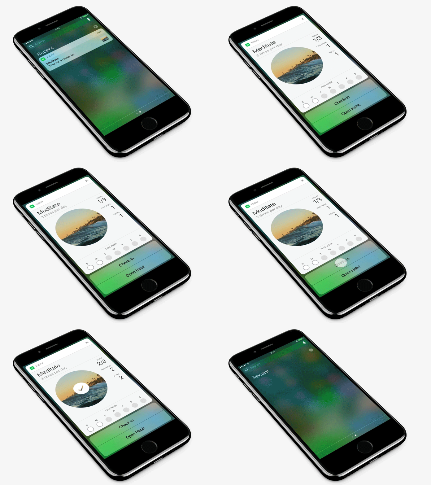
Reminders in Today use notifications which got a big upgrade in iOS 10 with the introduction of Rich Notifications. All notifications in Today, except those that come from habits marked as private, are Rich, allowing you check-in right from the notification screen and review important information about each habit.

New Apple Health Cards

Last but not least, we've updated the selection of available Health cards in Today to include new Health metrics also introduced in iOS 10. We’ve added: Swimming Distance, Swimming Strokes, Wheelchair Distance, Wheelchair Pushes and Mindful minutes all of them free for everyone to add to any habit.

The future

Our main focus for the next version is primarily the Apple Watch app. We've made good progress on that front and we can't wait to share more. More cards and service integrations are on the way and we've got a big list of smaller but really important features.

Enjoy Today!

September 18, 2016

Today v.1.1 – Multiple daily check-ins, multiple reminders and localisation

Summer ends with an announcement that we were very eager to make for quite some time. Today v.1.1 has been successfully released after being months in development. It took a bit longer than we expected but we believe that it was worth it. This is a big update that brings new features and paves the way for even bigger ones. Here’s some of the highlights:

Multiple Daily Check-ins

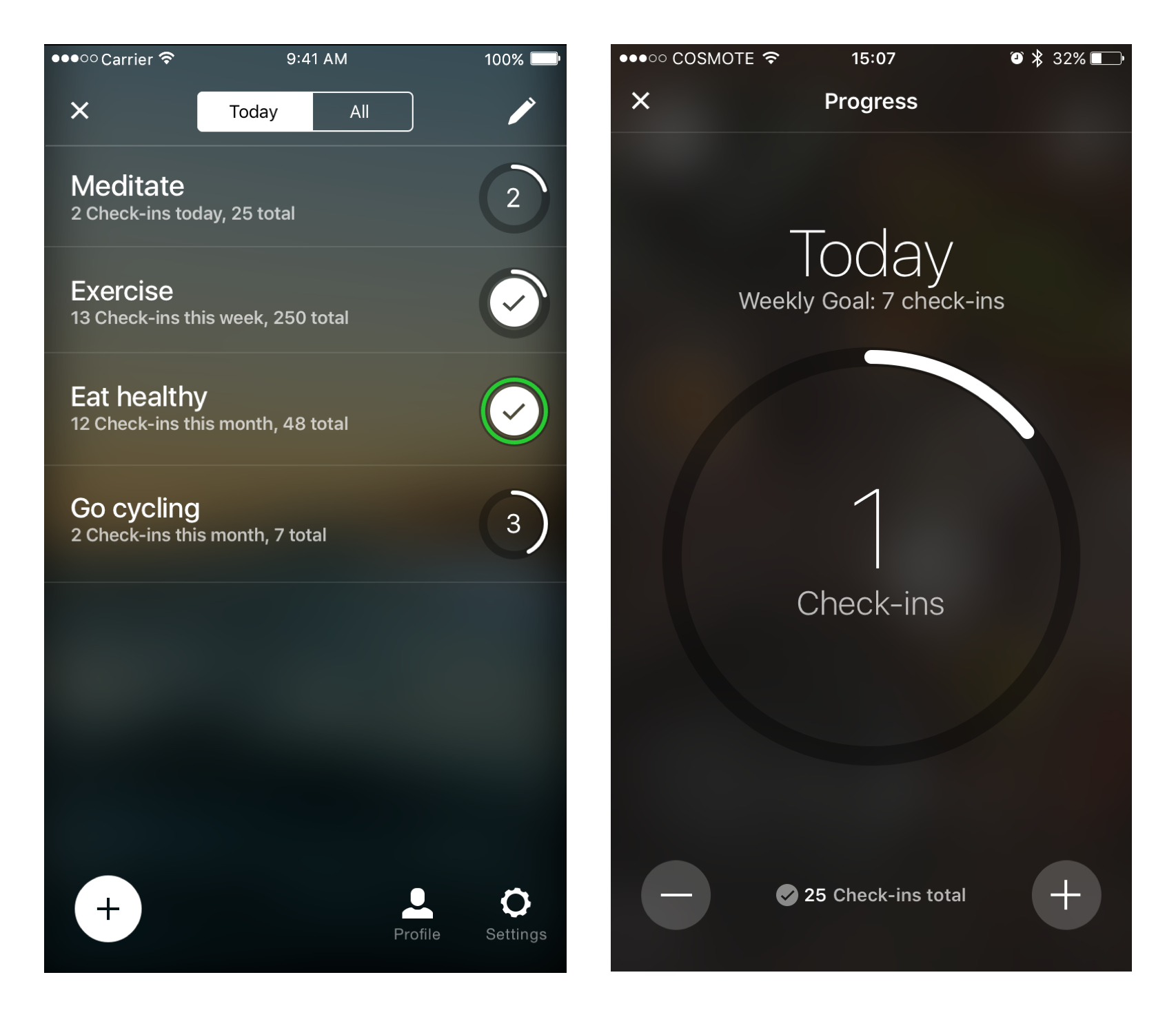
Ever since the launch of Today back in March, this was by far the most requested feature. In hindsight it made total sense: There are so many habits and activities that require tracking an action multiple times within the day and a good habit tracking app should support that at its core.

Today Habit Tracker - Multiple daily check-ins

Building this into the app, however, was not as simple it might seem. To do this right we had to rethink and restructure core parts of Today. From the way you setup a habit for the first time to support multiple daily check-ins to the way you track your daily progress and calculate your streaks.

In the end this was for the best. Today now tracks multiple daily check-ins beautifully and the rebuilt engine behind it now allows for greater flexibility in the way the you can setup your habit allowing
for weekly and monthly habits as well.

Better habits overview

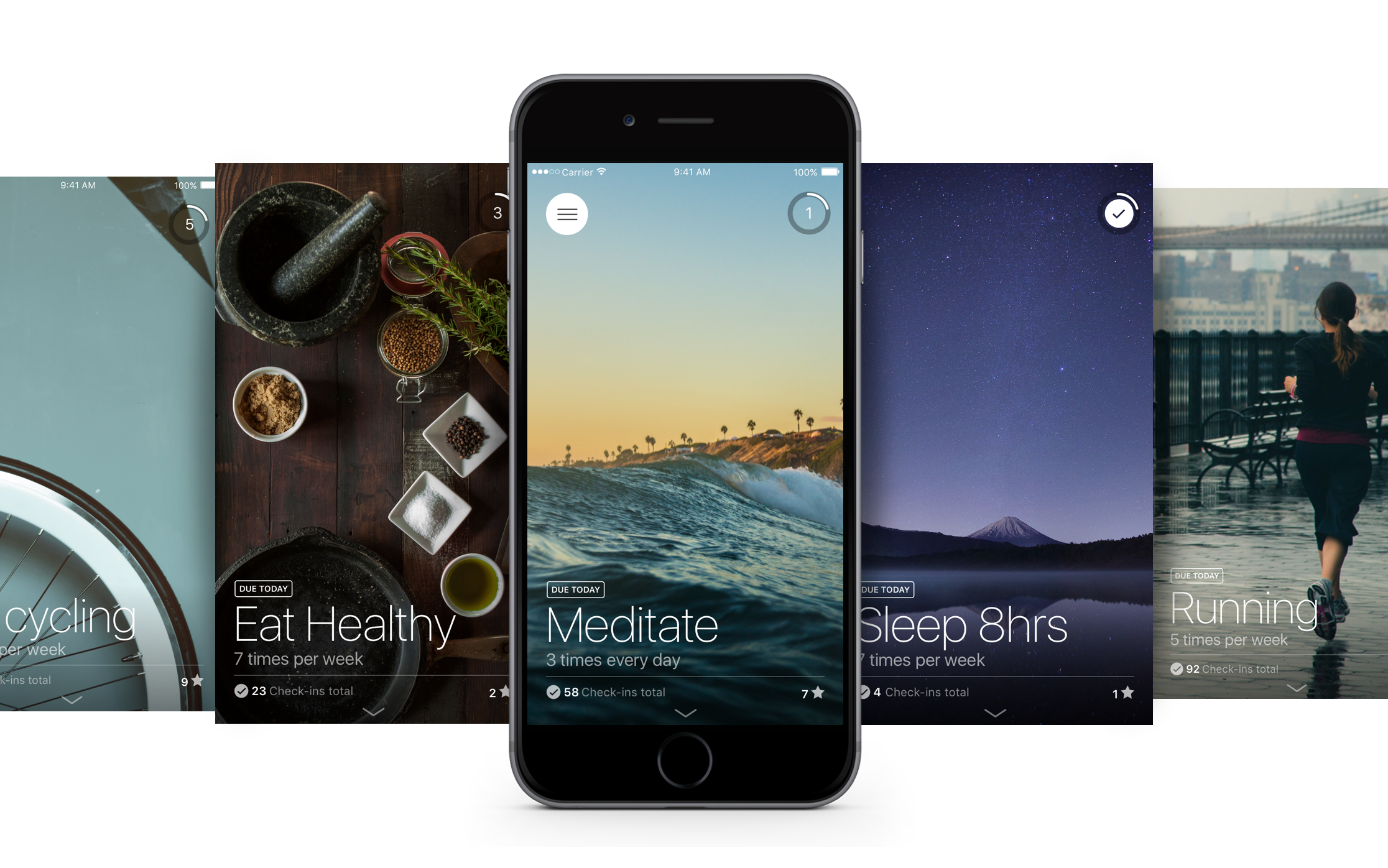
The work we did to support multiple daily check-ins lead to even more improvements. All habits now display their target frequency right on the cover so that you don’t have to look for it in the habit settings. You can now also check your progress simply by looking on the new circular progress bar that appears not the top left of each habit cover.

To help you track your habits even more efficiently we added a new screen, the Habit Progress View, where you can easily check your progress and edit your check-ins for the day. It is instantly accessible by tapping on the circular progress bar on the top right or from the streak calendar.

Today Habit Tracker - Habits overview screen and habit progress view

Lastly, the habits overview screen. The circular progress bar that you find on each habit cover is now visible in the habits overview screen so that you can see how well you are doing across habits.

Multiple custom reminders

This was a no-brainer for the proper implementation of the multiple daily check-ins but it’s available to any type of habit regardless of its frequency. Setup as many reminders as you need for each habit to get reminded as often as you deem suitable.

Localisation

Today now speaks Chinese, Japanese, French, German and Spanish! We’re planning to support more languages in upcoming releases of Today and we’re always open to suggestions. In the meantime your feedback is invaluable to us. Please let us know if you notice any phrase or word in Today that might seem weird or unsuitable for the given context.

What’s next?

A new version of Today is about to be released very soon with many improvements and fixes. Most importantly the next version will introduce a brand new notification widget. Reminders in Today come in the form of iOS notifications which got a big upgrade in iOS 10 with Rich Notifications. The upcoming release of Today will also include support for this neat new feature that will provide a data-rich context for your habit as you get notified.

Today for the Apple Watch is also in the works but it won't make it into the next release. We promise it will worth the wait!

Today v.1.1 wouldn’t be possible without the help feedback from our beta team. Thank you so much for your help! If you want to help us make Today better and try our the latest features first you can be part of our beta team

We hope that you enjoy Today and stay with us, we’ve got great things coming up.

June 21, 2016

1 million users worldwide

One million users worldwide
Today is really big and exciting day here at Neybox. Our mobile apps have surpassed 1 million users worldwide and we are absolutely thrilled about it. It is an important milestone that fills us with pride and joy and it wouldn’t have been possible without you.

To every single person that downloaded and uses our apps, we owe a great big thank you from the bottom of our hearts. Your support enables us to continue working on the apps you love, committed to making them better, more powerful while bringing us closer to building a greater family of products and services that will enable everyone to maximise and unlock their full potential.

To celebrate this moment we are offering a 60% discount on the price of the in-app purchases to unlock the premium features on Today, Pillow and the price of Timeless Timer, for the 22nd of June!

January 7, 2016

Infographic: Why sleep is so important?

The importance of sleeping well is often overlooked. Despite the fact that sleep science and still in its infancy, we have a plethora of studies, surveys and discoveries demonstrating just how sleep can affect our everyday lives on a surprising level. Below is an infographic containing some of the most important facts and figures about sleep that we have gathered as part of our ongoing research for Pillow, our sleep tracking app.

Infographic: Why sleep is so important? By Pillow Sleep tracking app

December 29, 2014

Introducing: Better Sleep Magazine

Introducing: Better Sleep Magazine

When set out to build Pillow, our goal was to build something beyond the confines of a good sleep tracking application that measures your sleep cycles. We also wanted to provide a high quality resource that will enable smarter decisions to improve sleep quality and gain deeper insight about each one’s personal sleep profile.

Our first step towards that direction was Snooze lab, constantly updated with smart recommendations, experiments and personalised tips. We are already working on its evolution and we are very excited about it. But this post is not about Snooze lab.

Today we are announcing a small but significant addition. It’s an on-line publication powered by Flipboard’s amazing platform. It’s name is ‘Better Sleep’ and it’s a weekly online magazine featuring a specially curated selection of articles related to Sleep Health, the science of sleep and useful tips recommended by sleep experts.

The format is very new and we are still experimenting with it but we really believe you are going to love it. It’s available for free though flipboad, accessible from your favourite mobile device or your desktop browser: here

Take a look, browse it’s content and let us know what you think.

Sleep well.

Copyright © 2024 Neybox Digital Ltd.