December 9, 2014

Timeless v.3.0 is here

timeless-hero

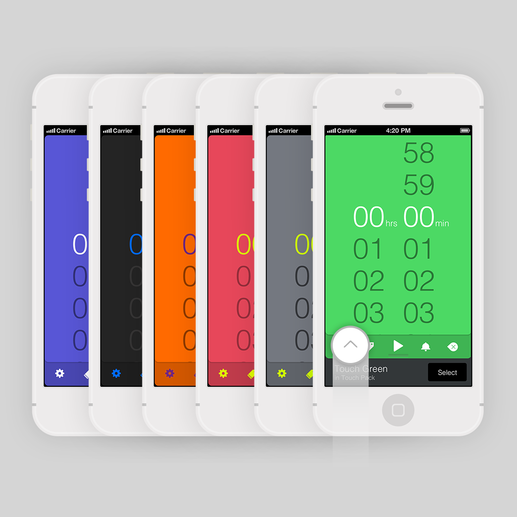
Timeless is our first app and it holds a special place in our hearts. So, we’re happy to announce that v3 has been released on the App Store. It brings a design overhaul, an adapted interface for the iPhone 6/6+, a today extension, support for new languages and a number of improvements in almost all aspects of the app.

Designwise

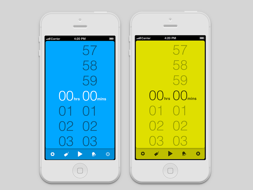
Starting from the design perspective, a refresh was required in order to support the new iPhone screen sizes. Timeless looks gorgeous on the new iPhone models thanks to Autolayout. We made the typography more crisp using lighter weights everywhere, increasing the sizes of the typographic elements to improve legibility. We also replaced the custom icon font we used in previous versions with a set of icons that we redesigned using Pixelcut's Paintcode, so that each icon is rendered using Core Graphics to achieve a pixel perfect result. And we also did the same thing with every UI element in Timeless too.
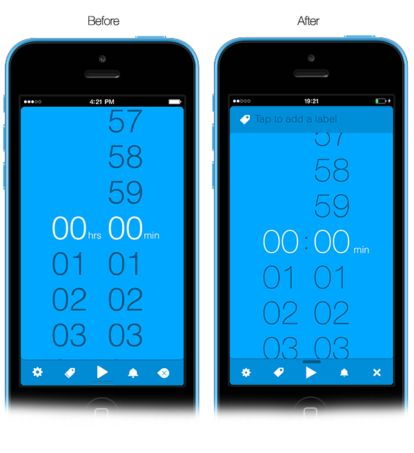
timeless-before-after

One of our most favourite parts of Timeless that got a redesign was the notifications panel which now adapts to the colours of the current theme. Goodbye colourless old panel.
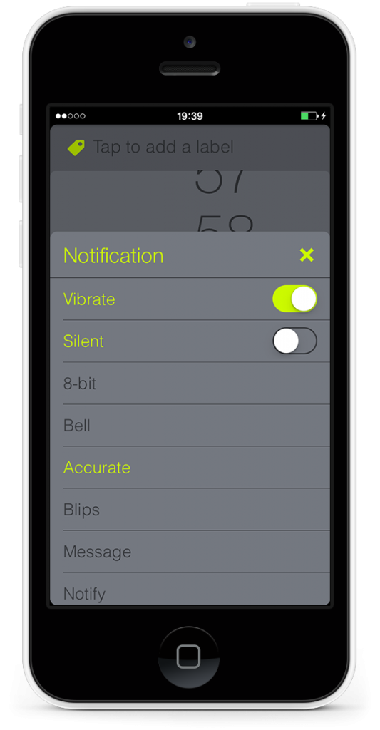
timeless-notification-panel

Brand new iOS 8 widget: Timeless in your Today view

Since iOS 8 was introduced, it gave us the opportunity to provide a widget (or a Today Extension in Apple’s language) for quick overview of the running timers. Our new version includes such a widget and in our experience it comes very handy in most situations. We would also like to provide controls on starting and stopping timers through the widget but unfortunately for technical reasons (having to do with notifications handling not being available through extensions) this proved not to be currently possible. We are investigating for workarounds and we’ll come back if we find something.
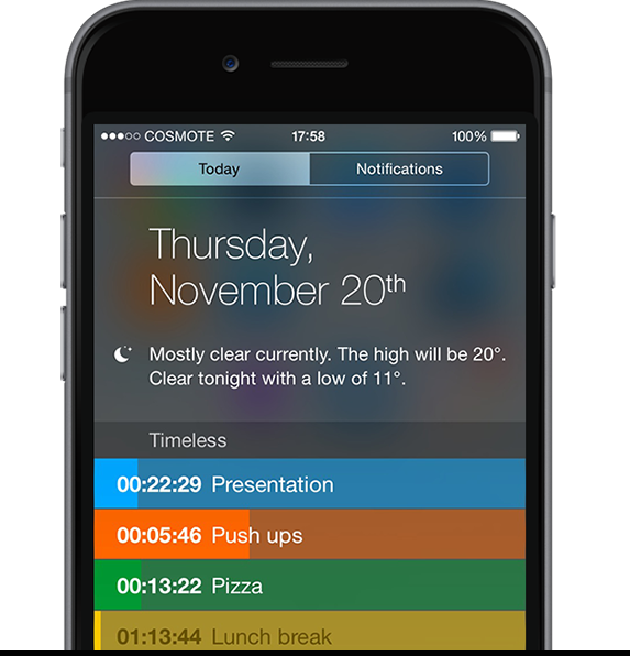
timeless-widget

Localisation

Timeless is now available in four more languages, namely French, German, Spanish and Simplified Chinese. We plan to add more languages in the future trying to make the app as accessible as possible to people regardless of their knowledge of English.

We owe a big thank you to Rob and Sarah at App Lingua. If your are looking for a good company to localise you app, visit their website.
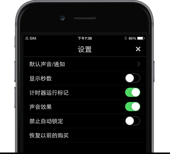
timeless-settings-panel-cn

Even more timers, sounds and a great give away

Apart from that there are a few new smaller features that we think you’ll love. The number of supported timers and stopwatches has been increased from 10 to 100, we’ve added five new sounds and also the ability to fully disable the device autolock when using the app.

Furthermore, we’ve consolidated the various theme and sound in-app purchases to one that unlocks the full app, making things a bit simpler for everyone. People that have already purchased any of the in-app items will get the full unlock in this new version without having to purchase anything further. Isn't that great? It's a big thank you to all of our users who have supported us all those years. We have a lot more in store for Timeless.

And last but not least, to celebrate this release, we also decided to offer all the Premium features of Timeless 50% OFF for a limited time! We invite you to try Timeless and we’ll be more than happy to listen to your comments and opinions.
June 13, 2014

We’ve got something to show you.

Untitled-2-big We started Neybox in 2011 to make great products and experiences that make a difference around us, in every little possible way. Products that we'd love to use ourselves. It takes a lot of  sweat, tears and caffeine to get there but we love it. The feedback  we receive from our users and clients at the end of the day is the most irresistible temptation to keep on going. This is our new logo, the mark that hangs above our door and flashes in our minds. The bright blue reminder to stay calm and keep on shipping. So yes, we've got something to show you and it's not only our new logo. Starting today with the announcement of Pillow we have a lot in store for the forthcoming months. Thank you so much to everyone who has made this possible.
October 26, 2013

Brand new Theme and Sound packs for Halloween.

Halloween-devices

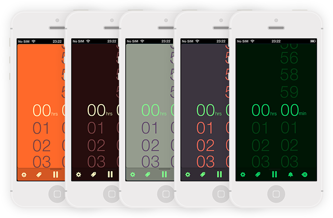
We love Halloween and the fun it brings every year. We've just updated Timeless with 5 new color themes and 5 new sound packs that will make your timing spookier. We definitely had a lot of fun coming up with the names and the notification sounds that we included. We we inspired all time classic  thriller figures like Dracula and the Werewolves as well as the zombies the and good 'ol pumpkins. Have a happy Halloween everyone!

September 28, 2013

Counting upwards: Preparing Timeless for iOS 7

  Timeless just got it's 2.1 update up on the AppStore all ready for iOS 7. It's been a while since we shared our experiences for the first version and we were thrilled to receive so much feedback on medium. (Keep 'em coming!) We're still pretty new with all this, it's only our first app but we sure learned a lot. Here's some of the highlights:

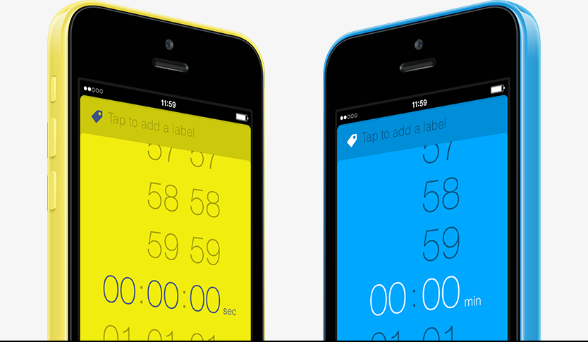
Designing for iOS 7. From version 1.0, Timeless felt closer to iOS 7's simplicity and lack of skeumorphic/realistic elements. It made more sense for Timeless and we would have stayed on this path even if Apple hadn't decided to completely get rid of skeumorphism and excessive realism in iOS 6. We're just so glad they did. In that respect, we've improved the typography, we've replaced the old icons with ones that we designed just for the app and we've added a beautiful circular progress bar that should have been there from the beginning. The next big version of Timeless that we're working on is going to be iOS 7 only so as to fully take advantage of what iOS 7 has to offer.

Colorful features. The changes in design were also combined with a major code overhaul that resulted in increased performance by up to 60% and significantly reduced loading time, in order for Timeless to be up and running almost immediately after tapping the icon. And speaking of the devil, our icon is brand new, more clear and adapted to the iOS 7 grid! Design apart, there were certain features much requested from our users that we thought necessary to implement in this version. For starters, there is now the option to set seconds in your countdown timers allowing you to set more precise time intervals. One of the biggest changes in this version is our brand new theme picker. In Timeless v.1.0 there was an option in the 'Settings' menu to change the color theme of all your timers. This was one of our favorites but it took too many steps to change the theme and we wanted to expand this feature by letting the user assign a different color on each timer and discover even more available themes that we are planning to release. The new theme picker is just a swipe away. Swipe up from the bottom to reveal the available themes and pick anyone you want any time by swiping left or right. Color coding geeks rejoice! What's more, 3 shiny new theme packs are already available in this version as in-app purchases and we've got so many more to come. We've added also 3 new notification sound packs as well each containing 5 notification sounds also available as IAPs.  

10

Free at last. Last, but not least, you may also have noticed that Timeless is now available in two forms, both as a free and paid app. The free option is more lightweight including 2 themes and 2 notification sounds and supports up to two simultaneous timers. Of course, the option to unlock the 8 remaining timers and the rest of the theme and sound packs is available through the app at a low cost. The paid version is essentially a value pack including the full 10 concurrent timers, 9 themes and 7 notification sounds and, priced at $0.99. We decided to go for this flexible model for users who want to get acquainted with Timeless at no cost and then progressively unlock the features they need. This way we can also offer the complete pack at a fair value for people that want the full power of Timeless right from the beginning. Thank you so much for your valuable feedback and comments. We've got so many things planned for the future of Timeless that we can't wait to share with you in forthcoming months. For now here's a little video that we made about Timeless:

May 3, 2013

Scratching an itch: The story behind Timeless for iOS so far.

We recently released Timeless Timer an app that we're really proud of at Neybox Interactive. The reception is amazing so far, and we wanted to share some of our experiences and thinking during this journey of building such an app. Sharing is a good thing, right? In any case it's a sort of thank you to those who took the time to share with us. Timeless Timer is a timer and stopwatch app that Spyros Passas and yours truly built, that we believe is very different from the rest. Typically I was responsible for the design, Spyros was responsible for the development but in reality, building such an app requires or, better yet, imposes a mode of collaboration that blurs the line between the two. Let me point out right from the start that we didn't choose 'Timeless' as a name to imply something about it's design. There is no such thing as 'timeless' design. As for the real reason we chose that name, just keep reading.

The itch

There are countless things you can time and probably as many reasons to do so. For us it really comes down to loving what you do and that can really become voraciously time consuming. So what do you do? You get organized. You write down things, use to-do lists, update calendars (by the way we did I mention we use 

Flow? we love that app), and of course you time things. There are plenty of timers out there, pretty good ones actually, but in our case we wanted a timer with these specific characteristics: 1. Available on the go. We wanted to time things everywhere, not only on our laptops. An app on our smartphones is the best solution we could come up with. 2. Stopwatch & Countdown functionality. Sometimes you need to find out how long it took to do something instead of counting backwards. 3. Simple and fun to use. Most of the apps we used were either too complex, requiring too many steps or over-simplified, sacrificing functionality. So here's what we made:

The interesting part is how we got there and what we learned in the process so we’d like to share some of the most important practices:

1. Build actual prototypes. Then throw them away.

It's painful but it's worth it. Contrary to what many believe, design is not just about picking colors and playing with photoshop. Design is how something works and no amount of photoshopping mockups can work as a substitute to picking up the smartphone and using the app itself. In this context, we didn't stick to static mockups but started building working prototypes very soon in the development lifecycle and kept doing so, revising our approach as we fiddled with the app.

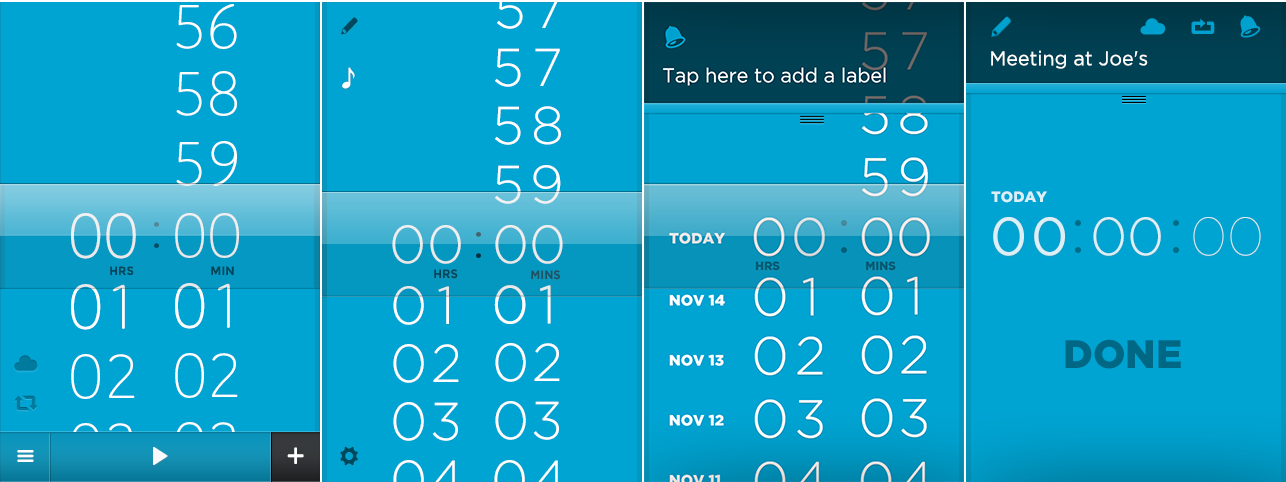
Here some really early (…and rather embarrasing) mockups we made, some of which actually made it to the prototype stage.

This process gave us a clear direction as to what worked and what didn't so we ended up practically recreating most of the standard iOS UI components. One of the most prominent components of the Timeless App is the time picker. Of course, UIKit already contains a picker component but the limitations imposed in customizing it are so many that we decided simply not to use it at all. Many more things had to be modified as well. The landscape view with the timers' table is actually very different than the default table component to provide easier and more intuitive handling of the timers (and we have more upgrades on this in the following versions) and even the "on/off" switch was actually rewritten to fit our standards. Small details one could say, but when coming together they have a profound impact on the final result. Meanwhile we started using Quartz Composer as an intermediate stage in the prototyping process and we are quite thrilled with the results.

2. Use the slowest device your customer might use.

Testing an app on the latest and greatest hardware can be too deceiving. Our set oftesting devices included an old iPhone 3GS even though most of our customers will probably run the app on newer models. The restrictions of slower hardware lead us to rewrite entire parts of the app from scratch and experiment with different ways to achieve the smoothest result possible. This in turn increased the quality of our code, and Doing all this testing and prototyping wouldn't be possible if it weren't for

TestFlight and Bugsense. They gave us the ability to download and try and monitor countless builds of the app on several devices, apart from making it super easy to send the app to our people outside our team for feedback and previewing before submitting the app.

3. Escape from your inner feedback loop.

Needless to say, we started using the app from it's early stages. We didn't stop there though. We wanted to gather feedback from a handful of people we trusted and valued their opinion so we send some Testflight invitations to download and use the app. A few days later we setup a fun little on-line survey asking about some of the most important questions we've been asking ourselves. This process helped discover bugs and shortcomings that we wouldn't have noticed ourselves.

4. Wait for the features to mature. When we set out to build Timeless we had a big list of features we kept only those that fit perfectly with each other so the initial release didn't have a stopwatch functionality. A few days after releasing Timeless 1.0 we came up with a way to make Timeless work as a stopwatch that in retrospect seems obvious. We knew this was the right moment to add that feature and we did.

The story continues.

Timeless is well on it’s way to v1.2 and we still have lot of things in store, even more things to learn and ideas to experiment with. A big thank you to all those that helped us ship something we love. If you found this article interesting, let us know and we’ll keep on posting updates about our progress.

Copyright © 2024 Neybox Digital Ltd.